Monday, October 17, 2011

The Backsplash

What is a backsplash and why does my kitchen need one? Well, besides being aesthetically pleasing, your kitchen backsplash provides an easy-to-clean surface for all those splashes and splatters that happen in cooking and dishwashing. There is no set area that a backsplash should cover besides being large enough to catch splashes.  Depending on the style and look of your kitchen, a large backsplash can give a look of cohesiveness, while a small, dramatic backsplash can provide an interesting focal point to the room. That being said, I have scoured some backsplash ideas to look at and tell you why they work so that you can decide what backsplash you want for your kitchen.


I will start with my absolute favorite photo of a backsplash that I have found while researching backsplash ideas. This backsplash does a brilliant job bringing the outside in with mimicking the colors of the outdoor foliage perfect in the mosaic of glass tiles. I wish there was a larger picture of this kitchen, but just by looking at the industrial-look stainless steel countertop and sleek black millwork, this balance of nature and function just works beautifully together. If you have a scenic window in your kitchen, a great idea might be to choose a color scheme of backsplash that compliments your view. This could work great on the water with beach tones of beige, blues and greens or in the city with greys and blues. I just love it!


My next favorite backsplash that I found comes from the idea of reclaimed and reusable materials. The backsplash in this kitchen was created using old subway tiles. It is not too easy to see in the photo, but it is pretty much just white rectangular tiles. The white backsplash looks perfect in this kitchen with the deep, beautiful rustic flooring and compliments it perfectly. Plus, you have the added benefit of a cool story behind your backsplash, and the satisfaction of knowing that you contributed to the green movement while creating an amazing kitchen using reclaimed materials. How do you find the reclaimed materials? That will take a little legwork. I know here by me there is a great antique shop that collects all kinds of materials from old buildings being torn down from tiles to stairways to doors. I would look around for businesses that reclaim materials, and they could help you seek out what you are looking for for your next project.


I consider this the standard and sleek, simple sophistication. Glass tiles are very popular for backsplashes and they come in all colors and shapes. This installation works great. The colors of the tiles blend right up into the paint color of this kitchen, and the soft, cool blues compliment the warm, dark hue of the cabinetry. This look was pulled together with the use of the brushed nickel hardware,  that has a “soft blue” feel to it. This look always works, as a designer I would not consider it different or amazing, but it is safe, will look great, and will definitely help your home in resale. 


 A splash of glass. I like this look. An all glass mosaic tile backsplash can be quite a colorful commitment in your kitchen, but I love the soft stone tile backsplash with the accent band of colored glass tiles around the perimeter. I think this look could be enhanced even more with a bolder color choice in glass tiles. Definitely a great and playful idea for most kitchens.


If you are going to go with a ceramic tile backsplash, why not go for a design more dynamic and interesting then the square or rectangle. I love this tile. It is exotic, beautiful, simple, and elegant. This could work in a traditional kitchen and would please most any potential buyer. 


Metal backsplashes are really popular right now. You can go to Home Depot and buy it by the sheet and have it up within a day. I think the floral print on this tilework is pretty. Metal backsplashes are not usually my first choice when deciding on a material, they can be beautiful but they really need the right kitchen to compliment such a bold move. Plus, sometimes the transition from backsplash to wall can be a bit awkward. It could be perfect for you! I have seen some amazing looking kitchens with great copper backsplashes that really shine and give the kitchen that warm and rustic look.


My suggestion, if you are really torn on deciding on a backsplash, is to buy a few sample pieces of the material you are looking at – and tape it to your wall. Seriously, it sounds silly, but look at it for a few days and see how you feel about it. I love this kitchen, it’s bright, cheery, and I could see myself baking apple pies and casseroles in it – now imagine it with copper, or glass tiles, or stones – or anything else for that matter – totally different look! It's a big decision, commitment and workload! But I have faith in you! Send me pictures if you want and I will be happy to give a nod in the right direction!


Labels:

Tuesday, July 19, 2011

What to Think About Before Deciding on Your Hardwood Flooring

Everyone loves the look of a beautifully installed hardwood floor, but there are many pre-installation decisions that need to be made that can affect the look, life and long-term value of your home’s new floor. Of course there are types of wood, color and finish styles, but an even more important decision is whether to purchase a pre-finished floor or a site-finished floor. Okay, maybe you haven’t gotten that far in your hardwood floor decision making process, well that’s okay – I am here to help!
You have two options when it comes to your installed hardwood floor: prefinished or site finished. What does that mean you ask? Here is the “easy” explanation: both floors are hardwood, the pre-finished floor comes ready to install, and it can usually be done in a day depending on the size of the room. It is already finished and ready to go. A site-finished floor is installed, sanded and finished on site. There are pros and cons to each type of flooring choice. Grab your pencil and start taking notes!
First of all, a prefinished hardwood floor is easy to install, comes in many colors and finishes that are packaged and ready to go. An accomplished do-it-your-selfer could do the job themselves if they were willing. The flooring has already been finished, so it does not need to be sanded and finished on site. Because prefinished flooring is coated in the factory multiple times, it has a very durable wear layer that is usually guaranteed by the manufacturer. Even with these advantages, a prefinished floor has some disadvantages as well. Prefinished floors can be hard to clean in the cracks between boards where dirt can be trapped. Another disadvantage of a pre-finished floor is when refinishing, it is necessary to remove more wood to get a level floor. A prefinished floor will also maintain height irregularities, meaning that if you have a bump in your subfloor, you will have a bump in your hardwood floor as well. Over time and homeowner changes, many people do not know or forget the actual manufacturer of their prefinished flooring, which can make it difficult to track down an exact match if board replacements are necessary at any point.
A site-finished floor is a little more work to install. You can expect a small crew, lots of sawdust, noise and time. But with this disadvantage comes many advantages to finishing you floor on site. Because you are cutting the planks on site, the boards can be longer than prepackaged flooring, giving your room a more seamless look. Another perk of finishing the floor on site, is you will not have the beveled edges of the prefinished boards. Since the flooring is installed and then sanded and finished, your floor will have a smooth, tabletop appearance. Sanding you floor onsite also will ensure that it is flat and even, regardless of subfloor, and will be more likely to forgive any irregularities in the floor.


Ultimately, the flooring you choose is up to you. Both options will provide your home with a beautiful and classic look that you will enjoy for years.

Labels:

Monday, May 23, 2011

Create a Classic Kitchen to Outlast the Trends

With the housing market in a slump, home improvement is on everybody’s mind. Just switch on the television and find HGTV, DIY, and other networks that are dedicated to helping you create the perfect look for your home. But how do you know what looks good today will still look good 10 years from now? How much money will you spend increasing your home’s value just to see the next new thing in home fashion come along and make your space feel second rate? How much are you willing to risk on the value of your home?
The most valuable space in your home is the kitchen, and the best way to create a timeless, classic look that will outlast the current trends is to collaborate your vision with a professional kitchen designer. Kitchen designers know how a kitchen should work. They can create an efficient and comfortable work space and also coordinate stunning cabinetry with coordinating countertops. Think about the cake baker, their knowledge or flavor, texture, and chemistry create that delightful cake you can’t stop eating. The cake decorator, though he may create a beautifully edible canvas, cannot change what is underneath the icing. The same goes with your kitchen, a few facelifts and design-on-a-dime color changes could make your kitchen “look” better, but designing a new kitchen with a specialist can add much more value to your home.


An example of how fickle the fashion trends of home improvement can be is the panel of top designers at a recent International Builders Expo in Las Vegas who listed upscale kitchen finishes such as granite countertops are more and more becoming less desirable with homebuilders and renovators. Not that long ago granite countertops were the hottest thing on the market. According to this panel of designers and contractors, buyers are now moving towards more affordable, low-maintenance, laminate countertops, which tend to last longer and come in various styles. Another example of a trend that is quickly picking up speed in kitchen design currently is glass countertops. Yes, I said glass. This is the trend for the current, modern-looking kitchen that many people are seeking. I am going to save you right now from losing thousands of dollars in your home’s value and tell you that this trend will come and go quickly. Though modern looking, this leaves your space cold and (industrial) feeling, not the warm and cozy feeling people usually look for in their kitchens.


So what do you do with this information? What does a classic kitchen look like? If that were as easy a question to answer everyone’s kitchen would look identical. But designing a classic kitchen goes beyond looks, beyond the current “hip” countertop material, it is creating the room that people linger in, that families spend time in, that birthday cakes are baked in, and Thanksgiving dinners are prepared in. A classic kitchen, though beautiful with crafted wood cabinets, the perfect amount of ornamentation and striking countertops, will be efficient in its design, well-proportioned and should have a well thought out layout of cabinets, speciality storage and appliances. Work spaces are created with the client’s needs in mind. A classic kitchen will reflect the architecture of the home and will have a timeless style that in 10 years will still look fresh. Everyone’s “classic” will be a reflection of their home and their individual style and working with a professional designer can help you find that perfect combination.

Thursday, March 10, 2011

The Sleep Retreat: Simple Steps to Make Your Bedroom an Oasis from the World

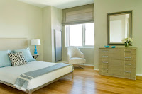
In today’s day of text messaging, status updates, and fast-moving television programming, sometimes we need an oasis to escape to. You don’t have to travel to the Maldives to get away from it all when a few decorating tips for your bedroom will design a serene place where you can retreat from the world.  Follow these simple steps to create a look for your room that will leave you feeling relaxed and rested!
1.       Keep it neat.  You should relax as soon as you walk into your bedroom, but you will do just the opposite if you walk into a cluttered mess with piles of clothes. Start by organizing your space. Utilize closet organizers so you will be more apt to put your clothes away in the right place the first time, especially if you prefer the chair to the drawer!
2.       Use simple decorations. Too many knick knacks, an entire family tree’s worth of photos, and walls plastered with excitable prints can keep your eyes moving around the room instead of closing. Keep your dresser and surfaces minimally decorated with a few favorite books, photos, or souvenirs.  A simple vase for fresh cut flowers can improve your mood and give off a pleasant, relaxing aroma.
3.       Remove the TV. Not only is your bedroom guaranteed to look better without that colossal appliance taking up your wall or dresser, but your mind will rest easier and over time train itself to know that your bedroom is for sleeping—and other things non-television related!
4.       Choose a tranquil color scheme. If a restful room is your top priority, go with a tranquil palette of light blues and greens. These colors promote peacefulness and relaxation and will give your bedroom that spa-like comfort to make catching those z’s a little bit easier. If you are giving your walls a fresh coat of paint, choose nontoxic or low-VOC paint for a healthier night’s sleep.
5.       Install window treatments that control light. You can choose from literally hundreds of window treatment styles, but for a better night’s sleep coordinate a black-out curtain or roller shade set in the window to block out any exterior lights. Sleeping in total darkness helps the body produce a healthy blood level of the hormone melatonin, which can improve your sleep cycle.
6.       Choose healthy, simple textiles. When it comes to your bedroom textiles, choose natural or organic fibers. Non-organic cotton sheets are often treated with a formaldehyde-based finish to prevent wrinkling, and considering you spend one-third of your life sleeping, sleep healthy! When it comes to the look of your bedding, choose patterns that are not overly contrasted with bright and dark colors. Your eyes will feel less strained if you choose a clean, simple pattern in the same soft color palette.
For a lot less than traveling to a far-away island, creating a relaxing space in your bedroom will help you get away from the day’s hustle and bustle and help you get a good night’s sleep. With a streamlined look, a little organization, and the right color palette for paint and textiles, you will look forward to falling into bed every night.

Thursday, December 2, 2010

Back from Venice Beach and found a little bit of it in Alabama: Spanish Colonial Revival

What better than a weekend at the beach, I guess probably living there! But since I am not so lucky to live on the beach, I can walk up and down and awe at the houses that are lucky enough to be there.


My favorite house on Venice Avenue, steps from the beach!


My favorite style of house on the beach is the Spanish Colonial Revival Style. For those of you that don't know, this style came about early in the 20th century. I do not think anyone considers it a major architecture or influential movement, but I think it is one of those understated styles that most people enjoy - if you live near a coast. Notable design features are:
The biggest places where this movement took off are the California and Florida coastlines. But in my research for this blog I found a piece of Spanish Colonial Revival architecture right here in Alabama, Mobile to be exact! The George Fearn House was built in 1904 and was the first piece of Spanish Revival architecture to be built in Alabama.


Mobile, Alabama
You might be saying, Tracy, you do interiors, not architecture! You're right! But where an architecture movement starts and interior movement follows! Spanish interior can be as modern and sleek as simple mediterranean colors with arches and dark woods or more fully embraced with Spanish-style textiles, brightly colored tiles, terrcotta flooring, and so on!


So, that is my little tidbit on Spanish Revival for the masses. I enjoyed my time in Florida! I wonder how wierd a Spanish Revival home would look on my dream 60-acre land with horses? Probably ridiculous! The search for the perfect style home continues.....

Sunday, November 21, 2010

The Victorian Era and The Shoals

So as I am delving back into my interior design roots, I decided to pull out my old text, History of Interior Design by John Pile and try to place some of the architecture and styles I see around the Shoals. This may bore some of you to death, so feel free to move on, but maybe you live in an older home or are interested in architecture...or you just are my friend and are kindly reading my blog, in which case...I love you, too!

No this house is not on Wood Ave, but it is a great example and was built in 1903

Besides the fact that Florence has a Frank Lloyd Wright house, which I will get to in another post, I mainly think of the Victorian-style homes of Wood Avenue (my third favorite street here). But when I drive this street I know which homes are obviously Victorian, but what about the other older homes....does their 100-year-old construction make them Victorian. This is still sort of a mystery to me, but the more I learn about the Victorian period of architecture and design, the more I realize that it was sort of a period of anything goes.

So what is the Victorian Era, and what does it mean - besides looking like a doll house. Well, for those who are curious I am here to the rescue with a little bit of shared knowledge (with help of course from Mr. John Pile).

Queen Victoria reigned from 1837-1901, hence the name, which overlapped a period of style revivals as well as new styles such as the Arts and Crafts (my favorite) movements in England. This also coincided with the Industrial Revolution. "Victorian" has come to mean an aspect on 19th-Century design characterized by the use of decorative, and at times too much decorative, ornamentation. The reason behind this frenzy of decorative excess is tied to the Industrial Revolution in the fact that where once homes were built and designed by architects, artisans, apprentices, cabinet makers, pieces and parts were now being churned out in factories, making decorative elements more affordable and available. Power looms could create textiles and fabrics faster than ever before. Cast iron was cheap and easy to create molds and mass produce elaborate designs.

The quality of this ornamentation declined dramatically of course, and the use of it became excessive none the less. But think of it like the introduction of Ikea to us - people could actually afford cool stuff! They could build and decorate their homes to look like the homes that only the wealthy were living in.

This will all lead to a rejection of ornamentation which you will see in some of the more modern movements of architecture and design, but for now, the Victorian fondness for combinations of decorative elements in all styles defeats efforts at classification. Interior design in the Victorian style is even harder to classify. The mixture of styles and the use of invented ornamentation have no clear roots, and people were free to mix and match, redecorate, alter according to their whim because design was more accessible to the masses.

Mix and match, redecorate, alter according to whim....this sounds a lot like my house, ha ha! But it is far from Victorian. But maybe this helps explain where the dollhouse qualities come from when we think of a Victorian home.

Hey, in case you were in the market for one, they restored this one on Wood Ave and even have pretty music to listen to while you look at the dreamy pictures :) I cannot say that I would decline if offered this house to live in, but it would not be my first choice if I have a dream house to choose from, but they are fun, and whimsical!

618 Wood Avenue Victorian Home